

How to use Python for automatic data collection and visualization in Excel
Python techniques for automating data collection and visuals in Excel

Excel is a powerful tool for data analysis and visualization, but manually creating reports can be time-consuming and prone to errors. Automating Excel reporting with Python can save you time, ensure accuracy, and allow you to update reports with fresh data at the click of a button. In this blog post, we will explore how to automate the process of extracting data, creating Excel reports, and visualizing data using Python libraries.
Why Automate Excel Reporting with Python?
Automating Excel reporting offers several benefits:
Time-saving: Automate repetitive tasks to focus on more strategic activities.
Consistency and accuracy: Reduce manual errors and ensure data consistency.
Dynamic and flexible: Easily update reports with new data and customize visualizations.
Enhanced analysis: Use Python's advanced libraries to perform complex data manipulations.
Getting Started with Python for Excel Automation
To automate Excel reporting, you'll need to set up a Python environment and install the necessary libraries.
Prerequisites
Make sure you have Python installed on your system. You will also need the following libraries:
pip install pandas openpyxl xlsxwriter matplotlib
Pandas: For data manipulation and analysis.
OpenPyXL: To read/write Excel 2010 xlsx/xlsm/xltx/xltm files.
XlsxWriter: To create Excel files with complex formatting.
Matplotlib: For data visualization.
Step-by-Step Guide to Automate Excel Reporting
1. Extract Data
First, let’s extract data from a source. This could be a database, a web API, or a CSV file. For simplicity, we'll use a CSV file in this example.
sales_data.csv
Date,Region,Product,Sales,Units Sold
2024-01-01,North,Product A,1500,10
2024-01-02,East,Product B,2500,15
2024-01-03,West,Product C,3000,20
2024-01-04,South,Product D,4000,25
2024-01-05,North,Product E,3500,30
2024-01-06,East,Product F,4500,35
2024-01-07,West,Product G,2000,12
2024-01-08,South,Product H,5000,40
2024-01-09,North,Product I,3200,22
2024-01-10,East,Product J,2700,18
import pandas as pd

# Load data from a CSV file
data = pd.read_csv('sales_data.csv')

# Display the first few rows of the dataset
print(data.head())
2. Process and Analyze the Data
After extracting the data, you may need to perform some data cleaning and analysis. For example, you can group sales data by region and calculate total sales.
# Group data by region and calculate total sales
regional_sales = data.groupby('Region')['Sales'].sum().reset_index()

# Display the processed data
print(regional_sales)
3. Create an Excel Report
Now, let's create an Excel report with the processed data using XlsxWriter for advanced formatting.
import pandas as pd

# Create a Pandas Excel writer using XlsxWriter as the engine
writer = pd.ExcelWriter('sales_report.xlsx', engine='xlsxwriter')

# Write the data to an Excel sheet
regional_sales.to_excel(writer, sheet_name='Sales by Region', index=False)

# Access the XlsxWriter workbook and worksheet objects
workbook = writer.book
worksheet = writer.sheets['Sales by Region']

# Apply some basic formatting
currency_format = workbook.add_format({'num_format': '$#,##0'})
worksheet.set_column('B:B', None, currency_format)

# Save the Excel file
writer.save()
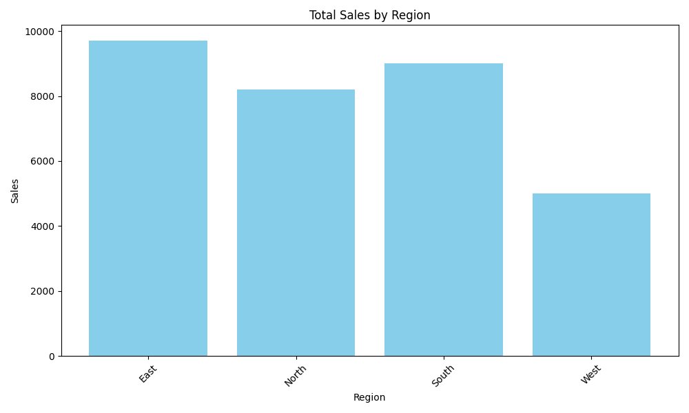
4. Add Data Visualizations
To enhance the report, you can add charts and visualizations using Matplotlib.
import matplotlib.pyplot as plt

# Plot a bar chart of sales by region
plt.figure(figsize=(10, 6))
plt.bar(regional_sales['Region'], regional_sales['Sales'], color='skyblue')
plt.title('Total Sales by Region')
plt.xlabel('Region')
plt.ylabel('Sales')
plt.xticks(rotation=45)
plt.tight_layout()

# Save the plot as an image
plt.savefig('sales_by_region.png')

# Insert the chart into the Excel report
worksheet.insert_image('D2', 'sales_by_region.png')

# Save the updated Excel file
writer.save()
5. Automate the Entire Process
To fully automate the reporting process, wrap all the steps into a single Python script and set up a cron job (Linux/macOS) or Task Scheduler (Windows) to run the script periodically.
import pandas as pd
import matplotlib.pyplot as plt

# Step 1: Extract data
data = pd.read_csv('sales_data.csv')

# Step 2: Process data
regional_sales = data.groupby('Region')['Sales'].sum().reset_index()

# Step 3: Create Excel report
writer = pd.ExcelWriter('sales_report.xlsx', engine='xlsxwriter')
regional_sales.to_excel(writer, sheet_name='Sales by Region', index=False)
workbook = writer.book
worksheet = writer.sheets['Sales by Region']
currency_format = workbook.add_format({'num_format': '$#,##0'})
worksheet.set_column('B:B', None, currency_format)

# Step 4: Add data visualization
plt.figure(figsize=(10, 6))
plt.bar(regional_sales['Region'], regional_sales['Sales'], color='skyblue')
plt.title('Total Sales by Region')
plt.xlabel('Region')
plt.ylabel('Sales')
plt.xticks(rotation=45)
plt.tight_layout()
plt.savefig('sales_by_region.png')
worksheet.insert_image('D2', 'sales_by_region.png')

# Step 5: Close the Excel writer and save the Excel file
writer.close()
Conclusion
This automation not only enhances efficiency but also allows for more advanced data analysis and visualization capabilities, making your reports more insightful and impactful. Start automating your Excel reports today to save time and focus on more strategic tasks!
About the author
Our company comprises seasoned professionals, each an expert in their field. Customer satisfaction is our top priority, exceeding clients' needs. We ensure competitive pricing and quality in web and mobile development without compromise.
Comments
Join the discussionNo comments yet. Be the first to comment.
Python
Whether you're a curious newbie entering the world of programming or an experienced developer looking to extend your skill set, this Python Series is your entryway to harnessing Python's potential.


